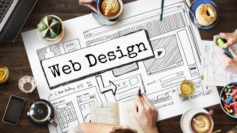
Web Design
“Web Design is the creation of a digital environment which encourages and facilitates human activity; adapts or reflects individual voices, and change gracefully over time while always retaining its identity.”
– Jeffrey Zeldman.
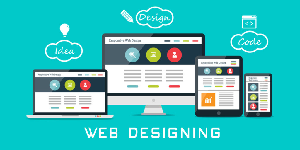
Web designing is the process of designing creative and engaging websites. It comprises of several various aspects such as content, design, layout, and more. As an expert web designer, it is imperative to implement and consider things like Social Media integration, Content Management systems, source code, good visuals, and smart effects.
A website’s design is more critical for conversions than you think. You can come up with the most innovating conversion boosting strategy in the world, but if it does not look appealing, it won’t benefit you in the long run.
A website’s design is not just something web designers do – it is the product, it is marketing, and mostly how it works. The more we’ve learned regarding design, the better the results we got.
Let’s talk about a few essential principles of an Ideal Web Designing :
Correct Balance
Every design component of web design has its very own weight or impact in the eyes of the beholder. Due to this, these elements or components should be used in a balanced symmetry around the vertical and horizontal axis to yield excellent visual results.
Grid Formation Rule
‘Rule of Thirds’ or ‘Grid Formation Rule’ is a basic principle of photography, but the rule also applies well into web designing. This principle needs you to divide the web page into a 3×3 grid pattern, producing nine corresponding blocks of the page. Now, by practicing this concept, you can put the engaging content of the web page and its key elements at the intersection points of the grids that automatically draw the viewer’s eyes.
Proximity
The proximity principle pertains to elements which share typical relationships regarding visual shape, weight, etc. There’s plenty of web designers out there who use this principle correctly. By applying this principle, elements with common connections are placed in proximity or are joined firmly with one another in a fixed pattern, while the odd ones are set at a distance to exercise cohesiveness and bypass distraction in the web design.
Rhythm and Space
Rhythm and Space work hand-in-hand for a website design, allowing your visitors to traverse along the content that you crave them to pay attention to seamlessly. A good web designer will never neglect to include this principle in a very tangible way for the viewers to successfully surf along the desired path throughout the web page.
Color Contrast and Typography
The color scheme employed in design is noticeably one aspect that retains in a visitor’s eye. It is the first deal maker or breaker a web designer needs to consider. First impressions last. A web page’s color scheme should neither seem too calm nor offending. Using a contrasting color theme is a good idea and renders a positive visual impression. However, a website designer has to pay attention to the typography employed on the web page as well.
Just do it right the first time, then make it stunningly beautiful. It’s unusually easy to overlook, and sometimes one may find himself struggling with creating a design of a particular page only to know later on that it was more apt to utilize minimal elements or even no design at all.
We hope this helps. All the best and happy learning!